This is a library of communication tactics composed by Mikayla Flynn.
Example 1: The Morning
This is an example of a newsletter. I read these just about every day. It is a newsletter from the New York Times, which highlights key stories that happened the day before or current stories that have been ongoing. You also have the option to view the front page of the current issue.
Example 2: The American Marketing Association
Another great example of a newsletter is the American Marketing Association in Knoxville. The newsletter features tidbits about upcoming events, past events, and sometimes things going on in the marketing world all over the world.
Example 3: HubSpot Newsletter
Another newsletter I enjoy reading is the HubSpot newsletter. It is slightly promotional, but also features relevant news information that people care to read. I think this is a great way to keep readers interested and the brand at the forefront of their minds. It also makes it easy for people to bring the information to work and remind coworkers that HubSpot could be implemented in their workspace.
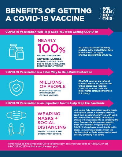
Example 4: COVID-19 Factsheet
This factsheet provides great information on the benefits of getting the COVID-19 vaccine. It is created by the Department of Health and Human Services (HSS). It can be used to validate peoples’ choice to get the vaccine and help persuade those who are on the fence about getting the vaccine. The intended audience is those outside the government who have a choice whether they should get it or not.
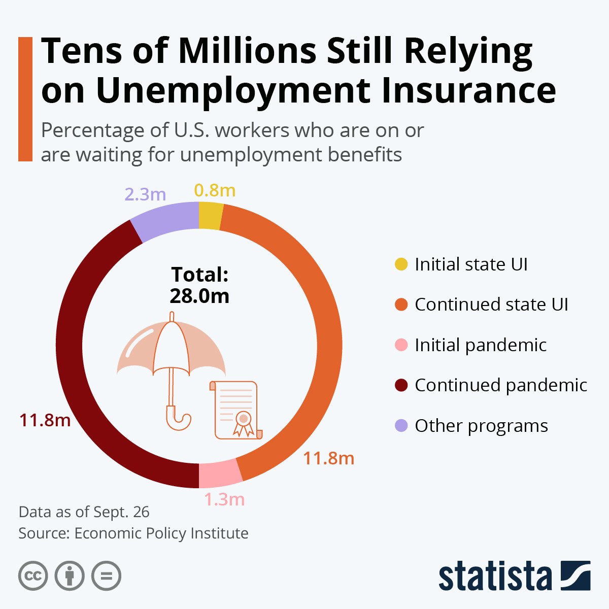
Example 5: Statista Unemployment
This chart displays valuable information about people on or waiting for unemployment benefits back in September 2020. The information is presented to make the public aware that this was going on in society around them. I think it is important that Statista included the data was as of a certain date so that it was not confused with another statistic that someone could have heard.
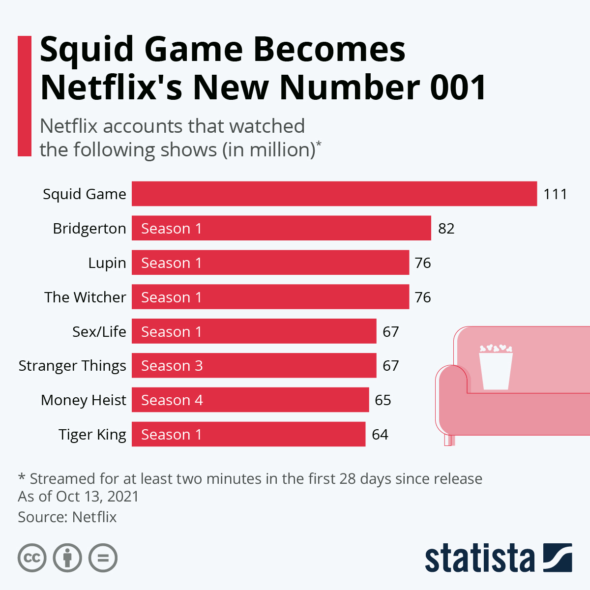
Example 6: Statista Netflix Top Shows
This more light-hearted chart shows that Squid Games became the most watched Netflix show. If you notice, at the bottom of the graphic, it includes a disclaimer that it was streamed for at least two minutes within the first twenty eight days of release. I honestly do not think that is a fair value to measure as I think it should measure fifty percent of the show, or at least an entire episode. Statista is a reputable source for gathering statistical data and it is used by many companies as a third-party way to share data. It helps the companies gain earned media.
Example 7: Statista Social Media
This infographic shows a comparison of the time it took for popular social media channels to reach ten billion users. This is very fascinating and provides insight into what companies should be using for their social media marketing, and is a way to show earned media. This proved just how popular TikTok is if it gained ten billion users faster than the other popular sites.
Example 8: Knox News
This article is an example of a hard news article. It starts with the key point, what happened, and the steps to where we are now with the situation, both the financial repercussions and the potential for beer sales to no longer be allowed. No matter how long the reader chooses to read, they will know the important things of the article.
Example 9: Taco Bell
This press release features information about Taco Bell giving out free burritos. It is intended for audiences who may not always go to Taco Bell to potentially gain new customers. It clearly states when the event will begin and the requirements for obtaining the free burritos.
Example 10: Princess Cruises
This press release is intended to share information about how Princess Cruises is letting frontline workers get free cruises. It is also a way to give the cruise line good publicity from an indirect source.
